Wedding tutorial in Corel® Painter™
By Karen Sperling
For many people, weddings are some of the dressiest days of their lives, and not just for the bride and groom, either. Everyone — from the honor attendants, bridesmaids and groomsmen, flower girls and ring bearer to additional members of the wedding party and the wedding guests — is spiffed up and as polished as the reception table place settings.
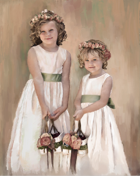
Photos taken at weddings are ideal images to turn into painted portraits in Corel® Painter™ because they show people at their best. I was commissioned to paint a portrait of flower girls, and here's the result:
Even if a wedding photo isn't taken for the purpose of a painting, with a little cropping and editing, it can be the basis of a beautiful painted portrait, as you'll see in the following tutorial.
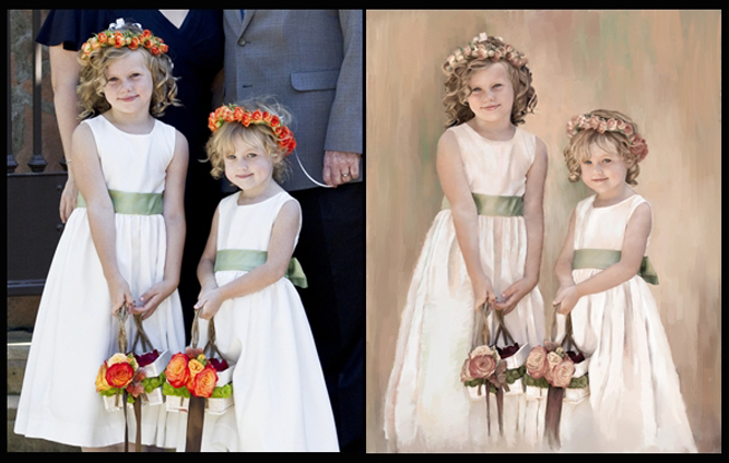
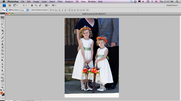
I started out with a photo of flower girls with their parents behind them. In Adobe® Photoshop®, I duplicated the image (Image menu > Duplicate) to keep the original intact and cropped out the parents in the duplicate using the Crop tool.
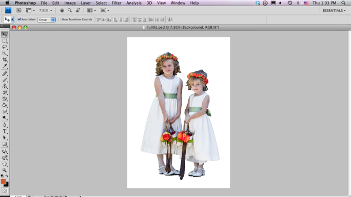
Still in Photoshop, I selected the girls with the Quick Selection tool and turned the selection into a layer (Command + J on Mac OS®; Ctrl + J, Windows®). Then I deleted the background, saved this file in PSD format, and closed it.
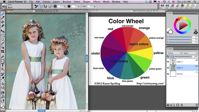
I opened the photo in Corel Painter and cropped the image just above the hems of the dresses. After you select the part of the image that you want to keep with the Crop tool, just click inside the area you selected to complete the crop.
I compared the photo to the color wheel to choose a color scheme, which includes all the tones and shades of the selected colors. Based on the colors already in the photo, I chose a complementary color scheme — colors opposite one another in the color wheel — of red-orange and blue-green.
1. I added a layer where I would paint the background by choosing Layers menu > New Layer.
A new layer appeared in the Layers panel. To access the Layers panel, choose Window menu > Layers.
2. In the Layers panel, I dragged the new layer below the girls' layer.
3. With the new layer for the background selected in the Layers panel, I painted shades of red-orange and blue-green. I used texture brushes found on the Artistry DVDs and CDs available at http://artistrymag.com/. You can also use the Square Chalk variant in the Chalk & Crayons brush category. Moving the Size slider on the property bar to the right creates larger strokes with texture.
The image was getting interesting, but it needed color harmony, an art theory where colors are repeated in the foreground and in the background.
In traditional painting, you might paint a glaze over the entire painting to tint all its colors with the same shade to unify them. With the idea of a glaze in mind, I added a layer of color.
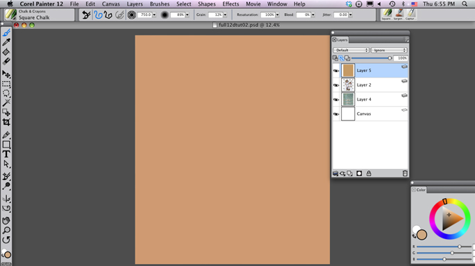
1. I added another layer by choosing Layers menu > New Layer, and dragged it to the top of the list in the Layers panel.
2. To unify the painting, I chose a light shade of red-orange, one of the colors in my chosen color scheme, in the Colors panel.
3. I then filled the layer with this color, by choosing Edit menu > Fill and clicking OK.
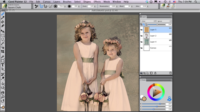
Then, I adjusted the layer.
1. With the top color layer still selected in the Layers panel, I lowered the Opacity slider in the Layers panel to 54%.
2. I changed the Composite Method (equivalent to the Blend Mode in Photoshop) in the Layers panel to Color.
This gave the image an overall color scheme, making it more painterly.
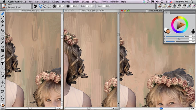
Next, I painted on the background layer. You can see the progression of the brushstrokes from left to right in the next image. I painted with the Sargent Brush variant from the Artists category and blended with the Water Rake from the Blenders category. To get the vertical lines in the background of the next image, I opened up the bristles on the Water Rake by choosing the Window > Brush Control Panels > Rake panel, lowering the Bristles slider to 6, and painting. I applied color with the Water Rake by raising the Resaturation slider on the property bar. I made sure that I included my color scheme's blue-green and red-orange tones as I painted to create color harmony.
After painting with color using the Water Rake, I clicked the Reset tool on the far-left side of the property bar to restore the default brush settings and blended the brushstrokes.
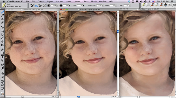
I painted the faces by first blending, then adding color, then blending, again. I enhanced highlights and shadows based on their location in the photo to build up contrast and add drama. I started by choosing the Just Add Water variant in the Blenders category and painting to blend out detail. I then lowered the Opacity slider on the property bar for a more subtle result.
With the face blended, I added some color based on the tones in the photo, starting with the highlights.
1. I chose the Square Chalk variant.
2. I then activated the Dropper tool by holding down the Option key on my Mac keyboard (Alt on Windows) and clicked on a highlight in the image to lift its color.
3. I then chose a lighter tone in the Colors panel and painted.
4. I blended the results with the Just Add Water variant.
I did this for the shadows as well.
1. Again, I started with Square Chalk variant.
You can select recently used brushes in the upper-right corner of the document window or at the top of the Brush Selector.
2. I activated the Dropper tool and clicked on a shadow in the image to lift its color.
3. I then chose a darker version of it in the Colors panel and painted.
4. I blended the results with the Just Add Water variant and repeated the steps for highlights and shadows until the face was filled in.
Next, I drew on the art theory that light hits the bottom of the eyes and the tops are in shadow. I painted the lower portions of the irises with the Dodge variant from Photo brush category to lighten them. You can see the painting progress from left to right in the next image.
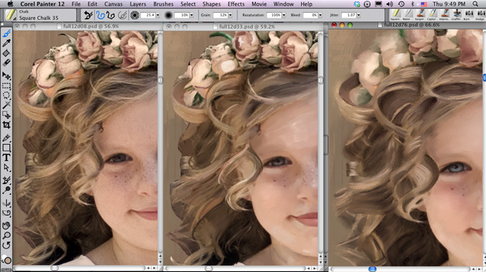
I painted the hair and flowers in a similar manner, blending with the Just Add Water variant, enhancing highlights and shadows with the Chalk, blending some more again with Just Add Water. I repeated these steps until I got the look I was going for. When painting hair, you want to isolate and enhance patterns of highlights, midtones and shadows. You can see the painting progress from left to right in the next image.
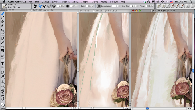
I painted the clothing the same way I painted the hair and flowers: Blend, paint, blend, repeat. In addition to painting darker tones of the same color in the shadows, I added darker tones of the complementary color, which in this case was blue-green. Painting complements in the shadows helps build color harmony.
And to wraps things up, I used two brush techniques to add to the image's painterly look. First, I painted rough edges for the dress using the Water Rake variant with the Resaturation slider on the property bar turned up and the Bristles slider in the Rake panel turned down. Then, using the Sargent Brush, I painted multiple brushstrokes next to the hand and flowers. You can see the painting progress from left to right in the next image.
And that's how I painted a portrait from a photo taken at a wedding!
Karen Sperling, the author of the first several Painter manuals, is the original Corel Painter expert. She’s also published several art-instruction books, including the current best-selling Painting for Photographers and Artistry Painter 12 Beginners Guide,which are available at her web site http://artistrymag.com/. She’s also created a series of Painting for Photographers DVDs, which are step-by-step guides for painting portraits and landscapes from photos. Karen Sperling has exhibited her fine art in New York and during Art Basel Miami. Her art and commissioned portraits are held in private collections around the world and are available through her web site, http://karensperling.com/.
Was this article helpful?
Tell us how we can improve it.