Cover Redesign
by Carlyn Beccia
In publishing, a book's cover can make or break its success. The cover is often the public's first conversation with the book so it needs to start off with the right impression. The most difficult aspect of any book design is simply being noticed. Book covers today have to work even harder to stand out amongst crowded shelves, and to look arresting at short distances or shrunken down to thumbnail size on sites like Amazon.com.
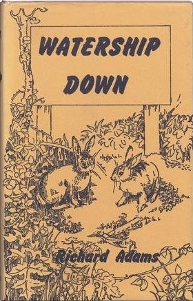
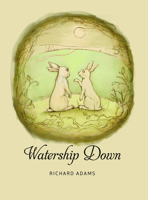
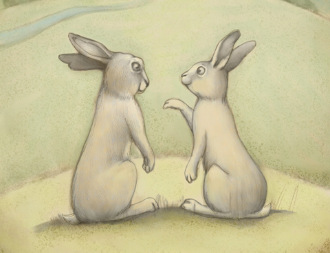
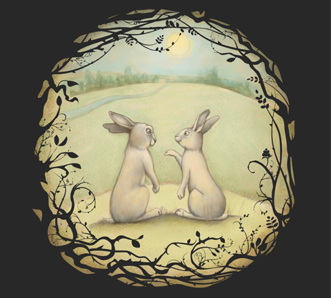
In this tutorial, I will show you the steps I used to redesign one of my favorite childhood stories, Watership Down by Richard Adams. In this illustration, I used vector art to contrast with a soft portrait of the book's two main characters — Hazel and Bigwig. Sometimes, just adding a modern twist to a traditional painting technique can give an updated look to a classic story.
Software Used
Corel® Painter™
Hardware Used
Wacom® Pen Tablet
Techniques
Watercolor Underpainting
Vector Art
Oil brushes
Impasto Effects
Step 1: Sketching a layout
Examining the past
Sketching
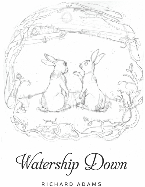
Setting tone
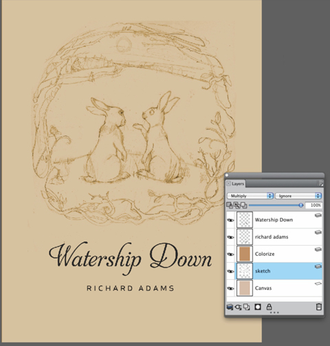
Nature is an important theme in Watership Down, so I wanted the background color and pencil lines to have an earthy feel. In Painter, I put the sketch on its own layer and set its Composite Method to Multiply.
Next, I used the Paint Bucket tool to fill the background with a light, yellowish brown. I created a new layer above the sketch layer and filled it with a darker brown color. I set this new layer's Composite Method to Colorize. This will make my lines look more like brown Conté crayon (see Figure 3). Lastly, I dropped the Colorize layer and the sketch layer down to the canvas.
Step 2: Creating a watercolor underpainting
Applying base colors
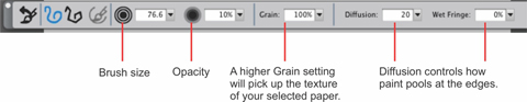
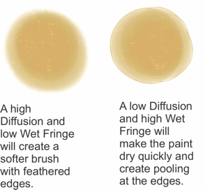
I created a new layer and selected the New Simple Water brush from the Digital Watercolor brush category. On the property bar, I changed the Opacity to 10%, Grain to 100%, Diffusion to 20, and Wet Fringe to 0 (see Figure 5). This creates a very soft tinting of color with some slight texture.
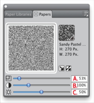
Remember that with any brush that has a Grain option, your chosen paper will determine the shape of the texture. I wanted my brush to pick up a very fine pebbled tooth, so I chose the Sandy Pastel Paper from the Paper Selector (see Figures 4 and 4b). To display the Papers panel, click Window > Paper Panels > Papers.
Adding more texture
To pick up even more texture, I next chose the Sponge brush from the Sponges brush category. On the property bar, I changed the Opacity to 20% and the Grain to 20%. I then created a new layer above the Base Color layer and painted in the mottled sponge texture. Lastly, I lowered the Opacity of this layer to reduce the amount of texture (see Figure 7).
I often vary these settings as I paint to avoid a tiled-looking texture.
Painting Grisaille figures
Next, I painted in the rabbits with soft gray tones by using the New Simple Water Brush that was used previously. I made sure to work from the outside in, keeping the edges darker. This creates more of a rounded feeling in the bodies that echoes my circular composition (see Figure 8).
Step 3: Creating a vector frame with Pattern brushes
Creating a vector brush
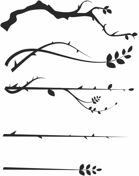
Using the Pen tool on a new layer, I created a thorny branch in black (see Figure 9). If I needed to adjust the branch, I used theShape Selection tool to adjust the points.
Adding a masked pattern
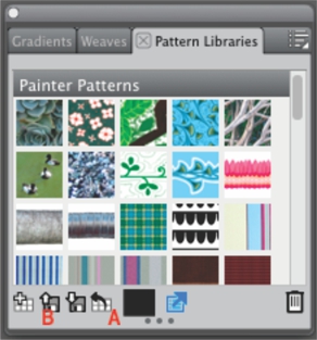
On my branch layer, I made a selection around the branch with the Rectangular Selection tool. I made sure to get enough space at the top and bottom. This step is important if you want to avoid feathering the black portion of your masked pattern. I then clicked the Capture Pattern button in the Pattern Libraries panel. To display the panel, click Window > Media Library Panel > Patterns (see Figure 10).
In the Capture Pattern dialog box, I named the brush Briar Branch 1, and set the Horizontal Shift, Rectangular Tile, andVertical Shift to 0. I then repeated steps 7 & 8 five times to create five different Briar Branch brush patterns.
Painting with patterns
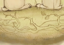
On a new layer, I drew a rough black frame around my painting. I selected the Pattern Pen Masked brush from the Patternsbrush category. From the Pattern Library, I selected one of my new Briar Branch patterns, and used my paint brush to paint in a swirling motion (see Figure 11).
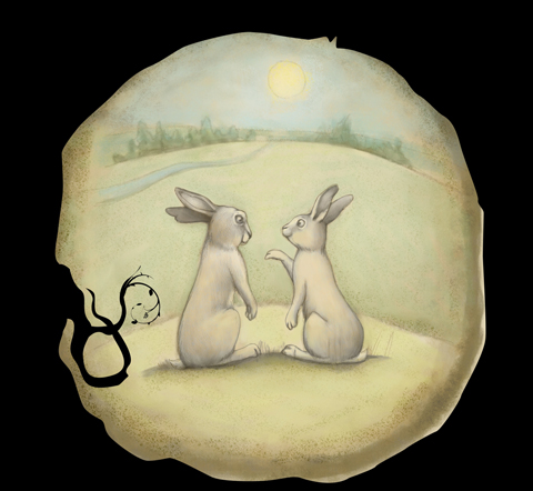
Figure 11. Using Pattern brushes saves time with repetitive elements.
I then painted with each of the different Briar Branch patterns around the circle (see Figure 12).
Was this article helpful?
Tell us how we can improve it.