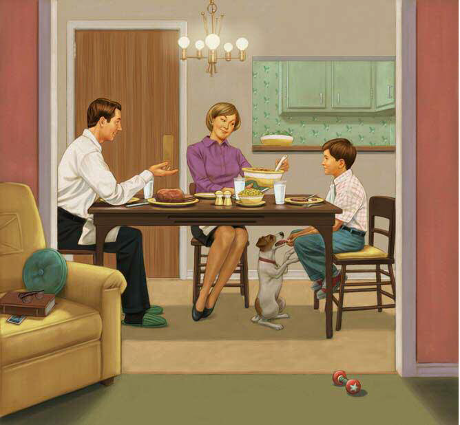
In this tutorial, I chose to recreate one of my illustrations from the book A Hero Named Howe, published by Raincoast Books in 2006. I wanted to keep the drawing style of this illustration retro and the design simple to fit the era of the 1960s.
This illustration was created by using a slightly different technique from the one I use today, but the principal is the same. Over time, my technique has benefited from the ability of Corel® Painter to replicate a variety of brushes and natural-looking media. I hope this tutorial will provide some tips to help your technique evolve as mine has.
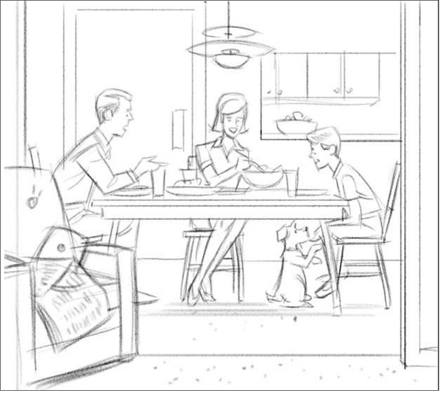
Step 1: Creating the sketch
I create the composition by keeping the sketch simple and cartoon-like. Before the editor approves the sketch, there is no need to draw too much detail.
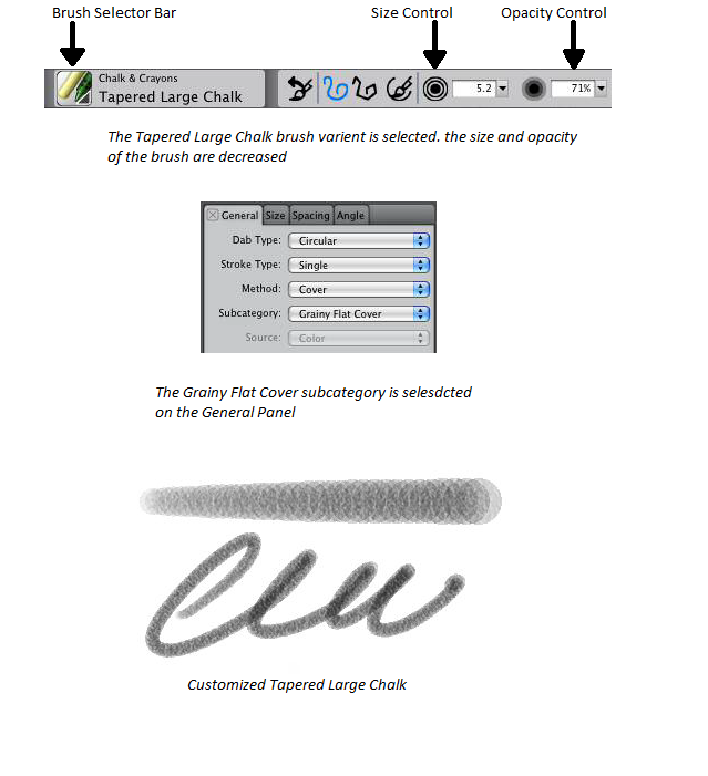
I draw the sketch relatively small on a canvas set at 150 dpi by using a Tapered Large Chalk with a smaller size and lower Opacity and set at Grainy Flat Cover.
The Tapered Large Chalk brush variant belongs to the Chalk and Crayons brush category and can be selected from the Brush Selector bar. The Grainy Flat Cover setting, a subcategory of the Cover brush method, lets you reveal the paper texture with each brushstroke. You can access this setting from the General panel (Window menu >Brush Control Panels > General).
Step 2: Tracing
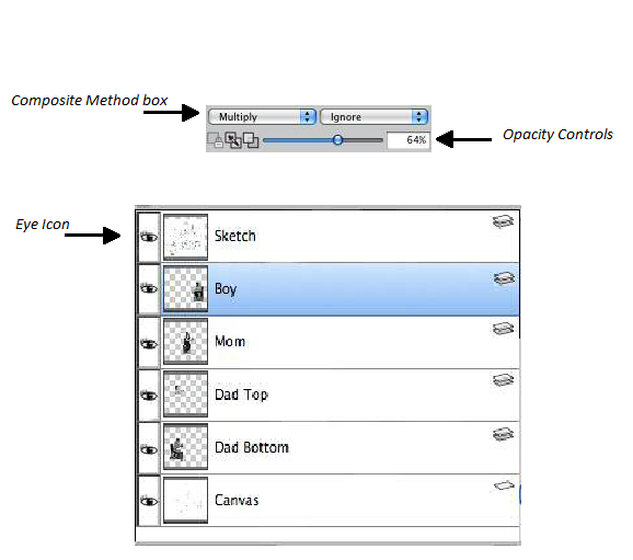
To help with the realism needed for the drawing, I pose and photograph models and collect reference material while using my sketch as a guide. To begin tracing, I create a RIF (or PSD) file at 200 dpi (File >New). The page dimensions are based on the size of the final artwork, allowing for bleeds. I layer all my reference material, including the sketch, above the Canvas. There are several ways to layer the material, but I prefer to create layers by first opening and selecting the reference images (Select menu > All). Then, using the Layer Adjuster tool from the toolbox, I drag the new layers to the file that will contain my illustration. I set the layers composite method to Multiply and lower the layers opacity (enough to see the reference and the underlying drawing). Using the sketch as a guide, I position the reference images with the help of the Layer Adjuster tool. I display or hide each layer as needed by clicking the Eye icons on the Layers panel.
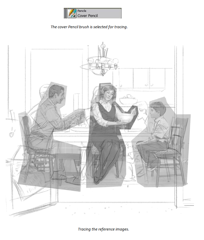
Next, I trace the reference onto the Canvas by using a Cover Pencil. You can also use any drawing brush with a fine tip for tracing.
I have converted all my references to black and white so that I am not influenced by their colors.
Step 3: Cleaning up the drawing
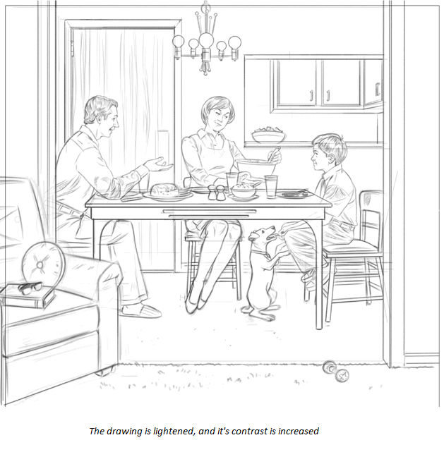
After I trace the important information, I hide the layers by clicking the Eye icons on the Layers panel. Using the Cover Pencil and Eraser brushes, I tighten up the drawing. Next, I add various elements that are still missing such as the dog, the chairs, and table setting. Then I increase the resolution of the pencil drawing to 300 dpi (Canvas menu > Resize). To remove some fainter lines and jaggy bits, I lighten the drawing and add contrast (Effects menu > Tonal Control > Brightness/Contrast).
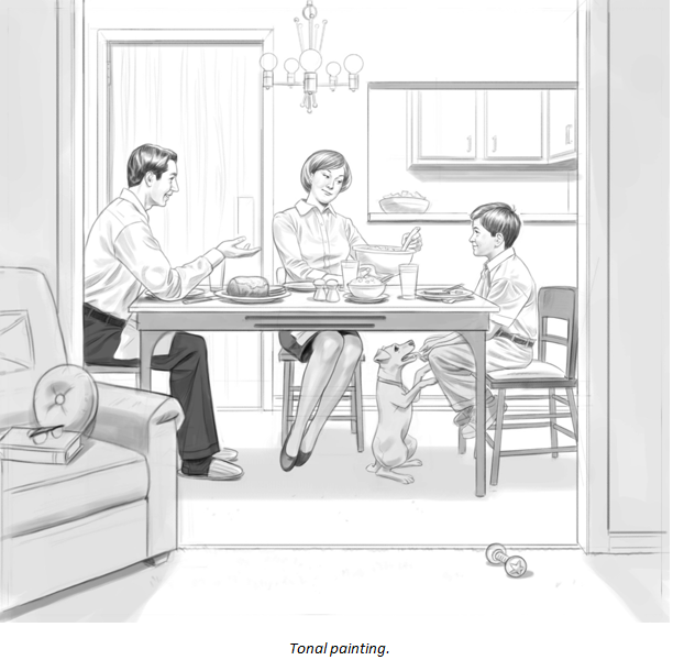
Step 4: Adding tone
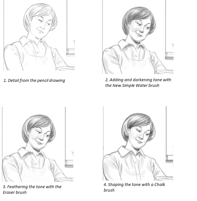
Before adding color, I create a tonal painting in black and white to help me define a foundation of light and dark areas. I build up the tone gradually with a New Simple Water brush from the Digital Watercolor brush category. (This task can also be accomplished by cross-hatching with a Pencil, Chalk or Colored Pencil.) The tone is applied on a new layer that has the composite method set to Gel or Multiply. The Gel composite method is native to the Digital Watercolor brushes; however, I find that Multiply works better when you use Digital Watercolor brushes together with other brushes. To gently build up the tone, I set the New Simple Water brush to a lower opacity and use mid-grey tones. By drying (Layers menu > Dry Digital Watercolor) and applying more washes, I gradually darken the tone. I also shape the tone by feathering it with the Eraser brush and drawing back into it with a Chalk Brush, Airbrush or Cover Pencil.
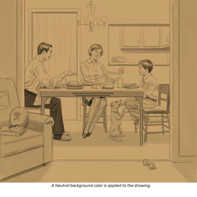
Step 5: Adding a warm neutral background
I lighten the drawing by about 10% (Effects > Tonal Control > Brightness/Contrast).Then I fill a layer with a neutral background color by using the Paint Bucket tool from the toolbox. I make the layer transparent by changing the layers composite method from Default to Multiply. Next, I drop the layer onto the Canvas (Layers menu > Drop).
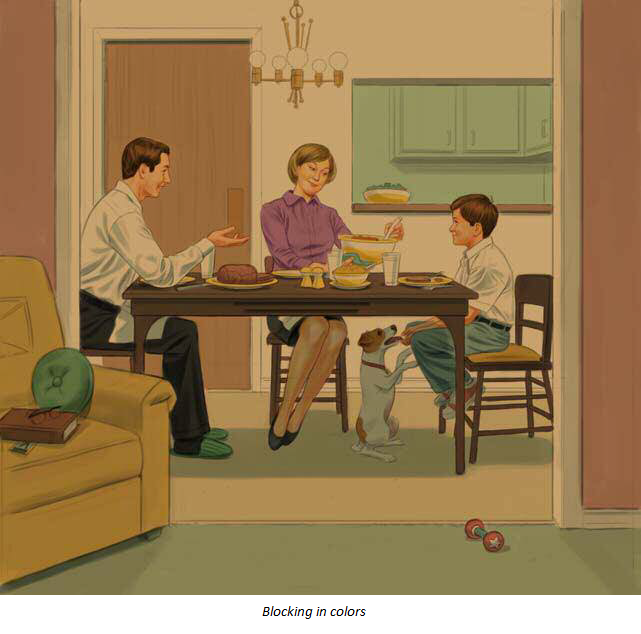
Step 6: Adding local color
Using the New Simple Water brush, I block in colors on a new layer with the composite method set to Gel or Multiply. I sometimes use the Fine Tip, Felt Marker, and Digital Airbrush to do this. Next, I drop the layer on the Canvas.
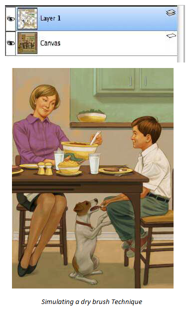
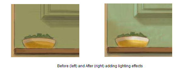
Step 7: Turning on the lights
Using a customized Tapered Large Chalk on a default layer, I simulate a dry brush technique. The lighter areas based on the local color (the color that is on the canvas as shown in step 6) are feathered over the mid-tones, and then the colors of the mid-tones are feathered over the darker colors.
The dry brush technique, which uses paint brushes that are relatively dry, helps me build up the lighter areas of the illustration.
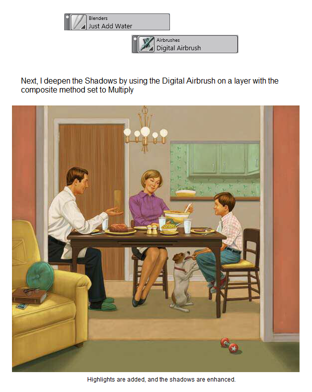
Step 8: Adding details
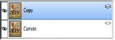
I drop the layers (Layers menu > Drop All) and duplicate the image by clicking Select menu > All and double-clicking the Layer Adjuster tool on the Canvas. I then use the Just Add Water Blender brush from the Blenders brush category to blend the colors together if needed. The duplicate layer is dropped and highlights are added on a default layer with the Chalk brush or Digital Airbrush (Airbrush brush category).
I find that having too many layers in a large image can slow down Corel® Painter, especially if the image is a PSD file. That is why, I prefer to use RIFF files, and I tend to drop layers to the Canvas as I work.
When incorporating reference in an image in the earlier stages of a project, I often tend to save layered files (such as _Pencil, _Tone, or _Color) after major steps. This helps me keep the layers without slowing down my progress
Step 9: Enhancing the illustration
I start the final stage by saving the image with a different name (adding _final to the file name). This way, I can keep my working file intact. Then, I select the entire Canvas (Select menu > All) of the new file, and I double-click the Layer Adjuster tool on the Canvas to duplicate its contents. Next, I brighten the image and add contrast (Effects menu > Tonal Control > Brightness/Contrast). Finally, I choose Thick Handmade Paper from the Paper Selector in the toolbox and apply a surface texture (Effects > Surface Control > Apply Surface Texture). I like to use the following settings in the Apply Surface Texture dialog box:
By making the changes to the duplicate layer, I can compare it with the original as I simply switch the layer on or off. I can also erase back through the layer to the pristine original that is underneath.
Step 10: Finalizing the file
I drop the layer on the canvas to flatten the image (Layers menu Drop), and I can now save the file to the TIF file format.
About the Author
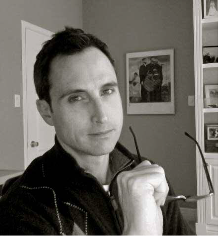
A well-established illustrator for almost 20 years, with traditional background in drawing and painting, Greg Banning now applies this foundation digitally. His work is sought after by major advertising agencies in Canada, the USA, and the UK. He has also worked with video game studios developing artwork for game titles and concept art. In addition, Greg has built up a solid reputation in publishing, with notable clients such as Penguin Books, Scholastic Canada, and Harper Collins. Greg has also illustrated critically acclaimed childrens books written by Mike Leonetti. Greg currently lives in Ottawa, Canada with his soon-to-be wife. To find out more about Gregs work, visit his Website
www.gregbanning.com and blog
www.gregbanning.blogspot.com.
Was this article helpful?
Tell us how we can improve it.
Thank you for your feedback.
Success
Thank you for subscribing.
Subscription activation email was sent.
Success
You're Already Subscribed
You will get an email as soon as the article is updated.
If you'd like to cancel the subscription to this article, follow the confirmation link from the email we've just sent you.
Was this article helpful?
Tell us how we can improve it.