What You Will Learn
- How to use the Alignment Guidlines
- Working with Text & PowerClip frames
- How to Save a File as a Template for Further Use
Introduction
Creating graphics for a small business can be a daunting task, unless you have a plan and a goal. In this tutorial we will be creating a template for a brochure. By using a template, you can greatly reduce the design time and allow you to ensure consistency from one project to the next. A video version of this tutorial can be viewed at the Corel Discovery Center.
The Set-up
This brochure, also called a feature sheet, can be used for a real estate agent when listing properties. This type of document is usually a single or double-sided document that is 8½ X 11 inches. Here it will take on the form of a 2 fold brochure.
1. After launching CorelDRAW, create a new document from the CorelDRAW defaults and have letter-sized page set to landscape. Set the primary color mode to RGB and the leave the rendering resolution set to 300dpi. Click OK.
2. Start by clicking the ruler in the top-left corner where they intersect and drag the cursor to the top-left corner of the page. This will reset the ruler position to the topleft corner of the page.
3. Click on the vertical ruler and drag out three guidelines, one at the 5 inch, one at the 5½ inch and one at 6 inch mark along the horizontal ruler to divide the page in half and create two panels with margins.
4. Using the rulers as a guide, drag out two horizontal guidelines and two vertical guidelines and place them 1/2" from each edge of the page.
How to Use the Alignment Guidlines
Alignment guides are temporary guidelines that appear when you create, resize, or move objects in relation to other nearby objects and are useful in page layout to align elements quickly and accurately.
1. Select View > Alignment Guides to turn them on.
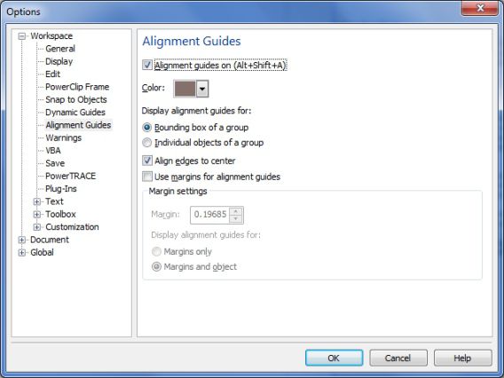
TIP: View > Setup > Alignment Guides Setup and change the color from Powder Blue to Dark Brown will make them much easier to see.
Working With Text & PowerClip Frames
As we are creating a 2 fold brochure, there will be a total of four panels. We will start on what will be the outside of the 2 fold brochure, so the panel on the right will be page 1 and the left panel will be page 4.
1. Using the Text tool, click on the right-hand panel just below the guideline at the top and type in an address, for example “1417 Birchwood Dr, Nepean Ontario” and below this put in a price: $389.00.
2. Format the text using a font that will stand on its own. A suggestion would be to use Bodoni Normal and set the point size to 18pt, centre justified and make it red.
3. Select the Rectangle tool and create a rectangle that is 4" across by 3". Right-click on the Toolbar and select Layout (the Layout toolbar is new to CorelDRAW X6). With the rectangle still selected, click PowerClip from the Layout toolbar. With versions earlier than CorelDRAW X6, it is not possible to have an empty PowerClip frame. Leave the rectangles as they are and then use the menu options to create the PowerClips when you need to work with the template.
4. Still with the rectangle selected, from the Interactive Tool layout, select the Drop Shadow tool and then on the Interactive Property bar under the Presets List drop-down, select Small Glow. Note that you will see no difference in the rectangle until you clip an image into the container.
5. Select the Text tool and create a text frame below the PowerClip rectangle that measures 4.5" X 1.5" and
then right-click on it and select Insert Placeholder Text. This is another feature that is new to CorelDRAW X6. To obtain placeholder text for earlier versions, visit http://www.lipsum.com/.
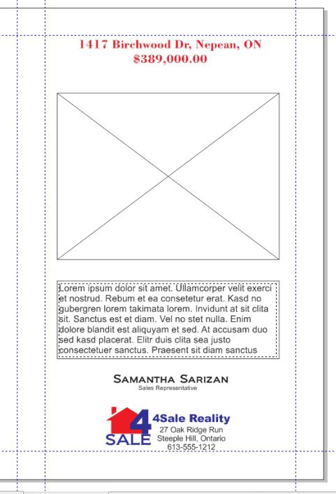
6. From File?Import browse to where you have a copy of your logo or business card and import this in. Click and drag to position it below the text frame.
7. If all you have is a logo, add your name and contact information. We are now ?nished with what will be the front of this Feature sheet.
8. Continuing on the left-hand panel, create six rectangles, 4 that are 1" X 1.5" , one that is 1.5" X 2.5", and the ?nal one that is 3" X 4 ".
9. Select each rectangle and convert them to PowerClip containers (remember, CorelDRAW X6 only).
10. Making use of the Alignment guides and the guidelines, position the four smaller rectangles, overlapping the corner of the 1.5" X 2.5" rectangle. Group these and centre in the top half of the left panel.
11. Apply the same Drop Shadow to each of these frames that we did in step 4.
12. Select the last rectangle and change the outline to 3pts, make it red and position it, centred on the bottom half of the left panel.
13. With the Artistic Text tool, type the text “Your New Neighbourhood” and make it Bodoni Normal 18pt and red.
Now that the outside of the template is complete we can move on to creating the layout for the inside panels of the brochure.
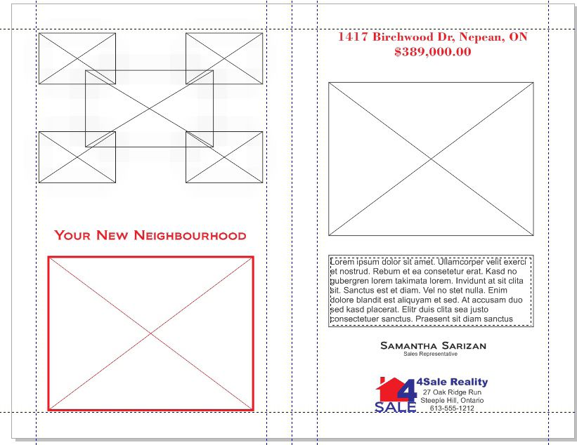
The process for creating the inside of the template is just as easy as the outside. We oly need to create a some frames for the image of the house that is for a sale and a text frame where we can show off the features of the property.
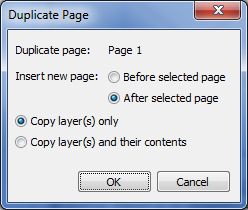
1. Right-click the page 1 tab and select Duplicate page. Do this After the selected page and Copy Layer(s) only. Click OK.
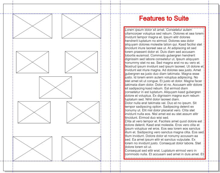
2. On the right panel for side two, create a rectangle that is 4" X 6.75". Give it a 3pt red outline.
3. Select the Text tool and position the cursor on the inside edge of the rectangle until you see the I beam cursor with a small AB. This is an indication that you are about to create a text frame inside the rectangle. Click the mouse button. Now Right-click and select Insert Placeholder Text.
4. Using Artistic Text, type the title “Features to Suite.” Set the font to Bodoni Normal 24pt and change the color to red.
5. For the On the left panel, create a rectangle that is 2" X 1.25". With the Rectangle selected, click on the PowerClip Frame icon on the Layout toolbar and then apply a Drop Shadow to it using the same settings as those on the other panels.
6. Duplicate this PowerClip container three more times and position them in the four corners of this panel.
7. Create a rectangle that measures 1.75" X 1", convert it to a PowerClip frame, and apply a Drop Shadow the same way that you have been doing the others. Duplicate this one four more times and position them in the same pattern as you did on the other side (in a cluster of 5).
Now that the template is complete, it is time to save it out to be re-used as and when required.
How to Save a File as a Template for Further Use
By saving this document as a template, it will enable you to quickly create a new feature sheet brochure in a moments notice. You can now save the file as a template.
To do this;
1. File > Save As and in the Save As type drop-down, select CDT – CorelDRAW Template and save the template to your MyDocuments folder so that the New from Template will be able to locate the file. Click Save.
2. The final step is to complete the Template Properties dialog box with the information for your template.
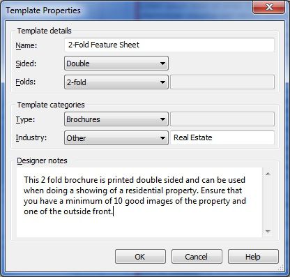
When completing the Designer notes, provide enough information to allow someone else to effectively construct the brochure. Doing this will ensure that when it comes time for you ro re-use it, you have ample instructions of finish the task.
Conclusion
With a goal, spending a bit of time planning and then executing the plan using a few simple tools and some basic principles of design, this project can be very rewarding.
If you have enjoyed this tutorial, be sure to check out the other tutorials that are available in the Discovery Center. If you have any ideas for tutorials or projects that you would like to see in the future, please leave us some Feedback.


Was this article helpful?
Tell us how we can improve it.