Finishing the logo
You are almost finished. Before you create the last piece, click the eye icon next to the Scanned image layer in the Object manager docker to display the blue sketch. Make sure that the Head layer is selected, and use the Bzier tool to trace the shape of the face (Figure 22). When you have a rough outline, hide the blue sketch to have a better view of the drawing (Figure 23). Finally, reshape the curve of the face (Figure 24).
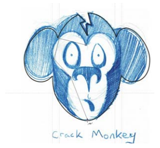
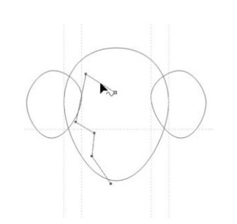
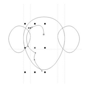
Figure 24: Reshaping the face curve
Next, duplicate and mirror the curve for theother side of the face. To ensure that the twoparts of the face are symmetrical, you can placea guideline in the middle of the face. First, click View > Dynamic guides. The dynamic guides are temporary guidelines that let you position and align objects precisely. In this case, you willuse dynamic guides to place a guidelinethrough the center of the main ellipse. Withthe dynamic guides enabled, select the ellipse,and then drag a vertical guideline from theruler to the middle of the face. While draggingthe guideline, hover over the center of theellipse until the word Center appears, andthen release the mouse button. The guidelinesnaps to the middle of the face. Align the leftand right curves of the face to the guideline.
Now, you will combine the two sides of theface. With the Picktool, click the right side ofthe face. Holding down Shift, click the leftside, so that both sides of the face are selected.Click Arrange > Combine to combine the twocurves. Next, you will connect the end nodes tocreate a closed shape. Double-click the curve with the Pick tool to activate the Shape tool.Drag the upper-left end node to the upper-right end node until an arrow appears next tothe pointer. This arrow indicates that the twonodes will be joined when you release themouse button. To connect the bottom nodes,use the Bzier tool. Hold the pointer over oneof the end nodes, and click when an arrowappears next to the pointer. Then, hold thepointer over the other node until the arrowappears next to the pointer, and click toconnect the two nodes (Figure 25).
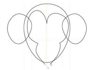
Now you have four objects: head, left ear, rightear, and face. Next, you will combine the head and the ears into a single object. Holding downShift, click the ears and the head to selectthem. Click Arrange > Shaping > Weld to combine the three pieces into one and remove the intersecting lines.
At this point, you can use the Shape tool to adjust the shape of the head and the ears. You may not like the shape of the ears, or the face may not be long enough. Make anyadjustments you like, and dont be afraid toexperiment.
Click a blank space in the window to deselectall objects. Using the Pick tool, select the face,hold down Shift, and click the head. Then,click Arrange > Shaping > Trim to cut out theshape of the face from the shape of the head.
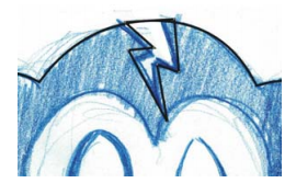
The last element is the crack at the top of themonkeys head (Figure 26). You can create this element by using the Bzier tool. Allcomponents of the face have now beencreated. Just turn on the Logolayer in theObject manager docker, and you have theCrack Monkey logo!
Designing a box
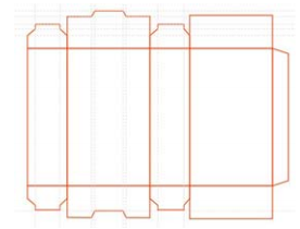
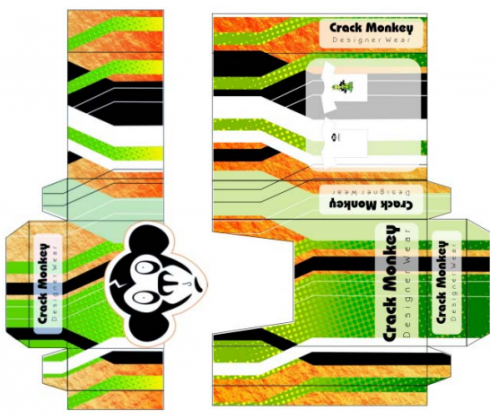
Logos have many applications. For example,you can use the logo to create a box. When youfollow the steps in this section, youll see thatproduct design is not as difficult as you mightthink.Take any cardboard box. Pull the box apartcarefully, trying not to rip any of the flaps. Keepyour tape measure handy, and take notes onhow the product was assembled. Next, scan the inside of the box as a black-and-white image. Import the image on a separate layer, and change the color of the scanned box foreasy reference.
Then, start tracing the box, this time using the Rectangle tool to create rectangles for the front, back, and sides of the box. Use the controls on the property bar to make sure that corresponding rectangles are the same size.Position the rectangles so that there is no spacebetween them (Figure 27). Make sure that the Snap to guidelines option is enabled, and setup guidelines to mark the corners of the top flaps on the scanned box.
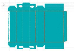
When the shapes for the front, back, and sides are done, select all of them, duplicate them,and position the duplicates above the original rectangles, making sure that there is no space between the shapes. Resize the top rectangles so that they match the flaps of the scanned box.To reshape the top rectangles, you must firstconvert them to curves. Select all of the top rectangles, right-click one of them, and choose Convert to curves. Each rectangle now hasfour nodes, one at each corner. Add nodes wherever you want to reshape the curves. Drag the nodes to the guidelines so that they snap into place (Figure 28).
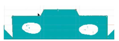
After you have made the necessary adjustments, duplicate the top shapes to create the bottom ones (Figure 29). Then,mirror the bottom shapes, and hide the scanned image to see the final result(Figure 30).
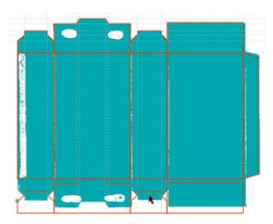
Figure 29: Duplicating the top shapes at the bottom
If you want to save the box as a template,remove the scanned image and the guidelines,and save the box as a CDT file.
Finally, apply color and text to the box, and add the logo design (Figure 31).
Creating a brand name
So where should you use your logo? That depends on how sophisticated your company is. Too much product placement can send the wrong signal. Using a logo wisely requires strategy and creativity. For instance, for my Crack Monkey business, I created larger business cards so that my clients could not just slap the card in with their existing collection of business cards. The larger size forced them to look at the card more closely than they normally would, simply because it was not the size they were used to handling. I also put the logo on a bag, because that would be free mobile advertising wherever the bag went. I thought about what would best influence my clientele and found addition always to use my logo (Figures 32 through 36).
Branding is important, because if you make a good product, people will buy other products from you based on your reputation. So thinkstrategically when deciding how to use your logo. It will definitely pay off!
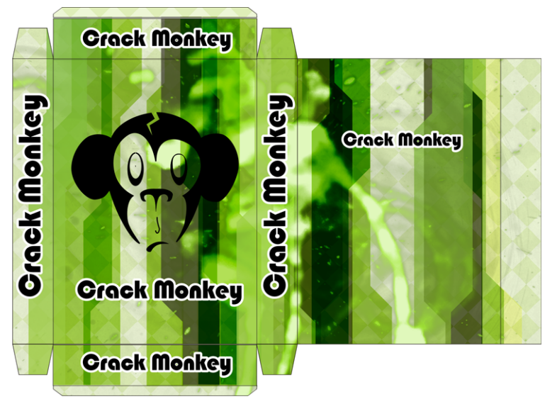
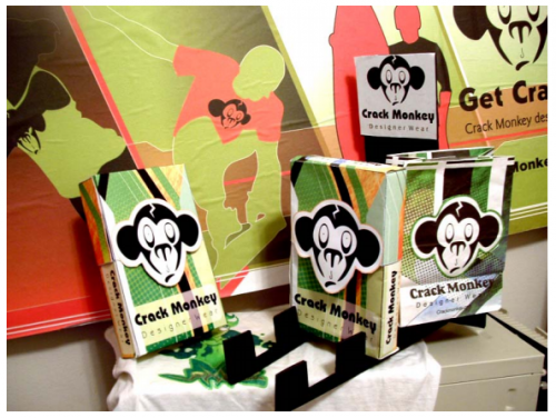
Figure 32: Billboard, boxes, and bags

Figure 33: Letterhead
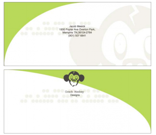
Figure 34: Envelope
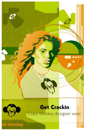
Figure 35: Magazine ad
About the author
Jacob Mesick has been a CorelDRAW user forthe past nine years. He is passionate about both traditional and digital art forms and works to discover new ways of combining these two creative areas. Having completed a bachelors degree in computer arts from Memphis College of Art, Jacob is currently an analyst for ARINC and enjoys freelance projects, which fuel his love for the visual arts.Among his many interests are digital photography, computer graphics, illustration,sign design, sketching, and painting.

For Part 1 of this article. click here.


Was this article helpful?
Tell us how we can improve it.